

Train Logo Concept

A logo concept based around trains, including app icon examples with only the logomark. This could be used for an app centered around booking train tickets, checking the schedule at your local station, and viewing prices and other relevant info.
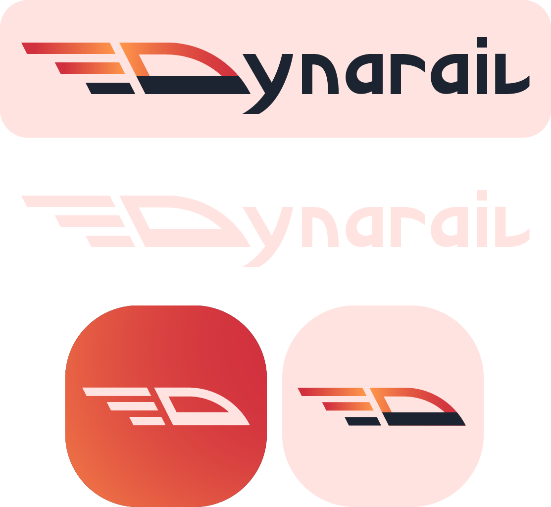
The vibrant color palette was developed to convey a sense of energy and excitement, while the shape language uses both flowing curves and straight lines to convey a sleek and modern brand image. In the context of an app, fast-moving imagery can also imply a quick, straightforward user experience. The simple silhouette is optimized for use on the web or in app icons, being easy to read at any scale.
Originally, this concept featured only the logomark and no wordmark. Later, though, I created a custom wordmark to make it feel more complete. The wordmark deliberately uses similar shape language to the logomark, with a balance of sharp, straight lines and flowing curves. This helps the two elements feel more cohesive. I limited my use of the slanted line motif for the sake of readability.